Villa E-1027
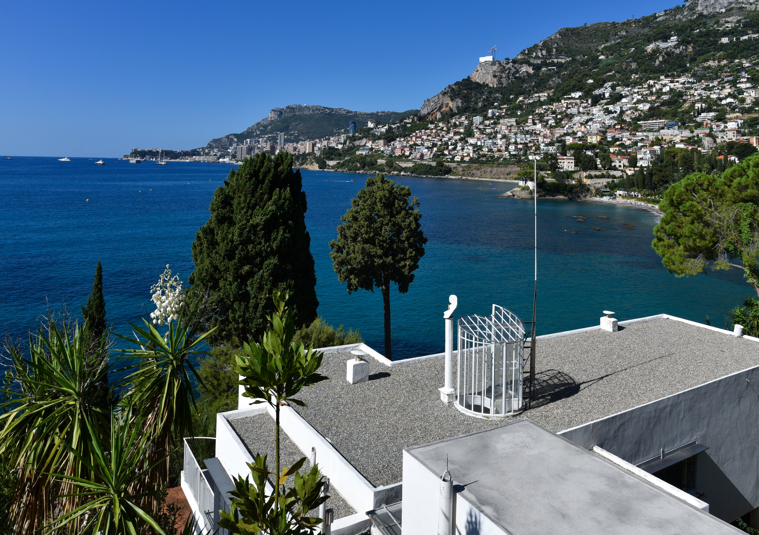
/VIEW OF THE MEDITERRANEAN SEA OVER THE ROOFTOP OF E-1027, 2018
Cap-Martin and Villa E-1027
This entry is the first of its kind for me, and with good reason. Instead of my usual one building one story, I have decided to share one incredibly special place, over two entries, with more than one architectural gem. In an extremely neutral fashion. At the end of the summer a long-anticipated visit to Roquebrune-Cap-Martin left us feeling dizzy. At this very moment some of you are rolling your eyes, shaking your heads, closing out of your browsers.. and some of you might be wondering what is she on about?
I am talking about that famous promontory, Cap-Martin, that juts out into the Mediterranean Sea in southern France. More than that I am talking about the buildings that are nestled into it. There are five. I hope to share all of them with you by way of fact and photo. To be even more specific: no narrative, just facts and photos right out of my Nikon, taken during our visit. The architects, Eileen Gray and later Le Corbusier. For lovers of modernist architecture and professionals alike, this seaside oasis has, at some point, become the center of a complex and often emotionally charged debate over actions and feelings of one or the other, or more likely differing opinions of everyone involved. I know this absolutely for two reasons. First, I have had conversations around this a few times myself with people of differing opinions and every time I come away a little less convinced of my own thoughts. Second, because after our visit I posted an interior photo of Eileen Gray’s refuge by the sea on my Instagram feed @the_wood_house . Almost immediately it began. A lively debate about not only the mural painted on the wall, but the architects themselves. After we visited, and saw how far the restoration process had come, heard some of the stories and reasons it came to be at all; I realized something. My admiration for the ever-inspiring Eileen Gray runs deep. The respect I have for Le Corbusier and his contribution to modernism is obvious. Their history is forever intertwined, at least here on this little jewel of a peninsula and preserving that history is far more important than any opinions I could ever offer. Also, I am no expert. Prelude over. My plan is as follows: to order the buildings by completion date, first to last, and to stay in the present save for some interesting historical facts. Fact checkable facts. To focus on our visit as we were able to step inside not only the seaside villa of one of the most inspirational women.. You know what? Let’s start right there.
Eileen Gray could be considered one of the most interesting women in design of her time. I say this not for lack of inspiring female contemporaries. There are quite a few, some of which I have written about here, previous. But Eileen Gray stands out, at least for me. Her intrigue is not simply about her work in art and design, furniture, interiors or even architecture in male dominated fields during this period of history. It is about the way her mind worked. She took things in and processed the information not only as an artist, but as a person who was acutely self-aware. It’s easy to say that one knows their strengths and weaknesses, but for Eileen it was a sharp understanding of what she wanted to do and maybe more importantly what she did not want to do. I believe this allowed her to take on everything she did with great care and passion. More uniquely, it afforded her the confidence to walk away completely when she saw fit. A rare and wonderful disposition. Something I positively respect and admire. She was less straight forward to the public, often hard to read and seemingly an absolute workhorse. From all that I have read and learned about her, she understood one thing. Reliance on anyone else would never achieve the results she expected of herself. This is not to say she was not influenced by the people and events surrounding her; she was I think, but not in a conventional way. I believe she saw the world - the people she met, the ones she loved; the places she visited, the places she ran from and gravitated to - all of it, as inspiration which gave rise to her amazing work. This is what has made her an important inspiration in my life. She had the ability to understand her life experiences, both good and bad as a whole and used it all in her process to create. Here in villa E-1027 you are able to understand Eileen Gray’s charming wit and organization of mind. She wrote of the holiday home’s objectives: ‘House envisaged from a social point of view: minimum of space maximum of comfort.’ A prototype or research project for modern living and a model for future work. Maybe more than that, Eileen thought of this first architectural project as a peaceful retreat for her and her then lover; Romanian architect, editor and critic Jean Badovici with whom she shares credit for E-1027.
EILEEN GRAY’S MODERNIST VILLA E-1027, 2018
Much like Gray did in 1925, we followed the narrow walkway that runs along the railway line to reach the villa. Now as then there is no proper road leading to it, the entrance and most of the house still out of view when we began to descend the terraced and beautifully wild landscape leading to a small path. Not easy terrain, but Eileen preferred this dynamic and rugged stretch to any “lush beachside.” She studied the land, it’s vegetation; evergreen and lemon trees against the blue of the sea.. and made a firm decision not to impact the existing topography whatsoever during her build. E-1027 embraces the landscape just as she found it, but does not disturb it. Nestled into this rough coastline, 100 feet above the Mediterranean Sea, Eileen Gray had found her solace. Here she had built a house that in a very real way expressed her personality.
“… a window without shutters is like an eye without eyelids…”
- Eileen Gray
As we approached the building we saw our first bit of thoughtful design. The shutters. Eileen wanted the villa to be immersed in its environment; to harness the warmth of the Mediterranean sun and use the cool seaside winds to regulate the temperature inside the villa. Shutters commonly used at that time were simple, and when closed allowed for very little air flow. Ever the problem solver, Gray constructed a unique shutter system on rails set away from the window, which allowed for constant and sufficient air flow. Not only are the shutters able to move along the rails, but upward for effective control of the sunlight throughout the day. The manual shutter system is a clear example of wonderful and effective design put in place to be changed or manipulated by the dweller as they saw fit. She thought of E-1027 as an extension of the people living in it; “a flexible structure whose occupants would invest it with life… The dwelling as a living organism.”
We walked past towards the entrance.
The entrance is wide for a house this size but the rounded blue wall draws you in. Once you are standing in front you realize there is not one, but two entries. Already we see a bit of the architect’s humor. Stenciled on one side “sens interdit” no entry. On the other we read “entrez lentement” enter slowly. Here a dialog is started between the house and the visitor. It continues inside, playfully guiding with a bit of wit and a wink. No entry to the maid’s quarters and kitchen, left; but do enter slowly to the right.
Before we step inside it’s important to understand that E-1027 is still in the restoration process. We were lucky to be able to see it before the next phase of work begins. The house was found in pretty bad shape before the first restoration effort began. You can read more about that here. That said, I am not absolutely clear on what had to be replicated due to severe damage or complete loss and what was able to be salvaged, so I will not venture a guess. Unless.. I have a source. It just so happens that I do indeed have some information on that leather letterbox that I am completely smitten with. We were told that it had been remade from Ms. Gray’s original by Hermès. Coincidence favourite remaking favourite? I think not. Perfection from perfection? Absolument!
A MOST THOUGHTFUL DETAIL
A particularly incomparable feature inside the villa was the rounded partition wall separating the entry hall from the main salon. Architecturally reminiscent of a boat, and smartly painted to continue the horizon of the sea, it allows the eye a perfect line from the inside out. This thoughtful element, painted by Eileen the artist this time, wholly connects the villa to the sea just beyond the glass.
music corner in the main salon
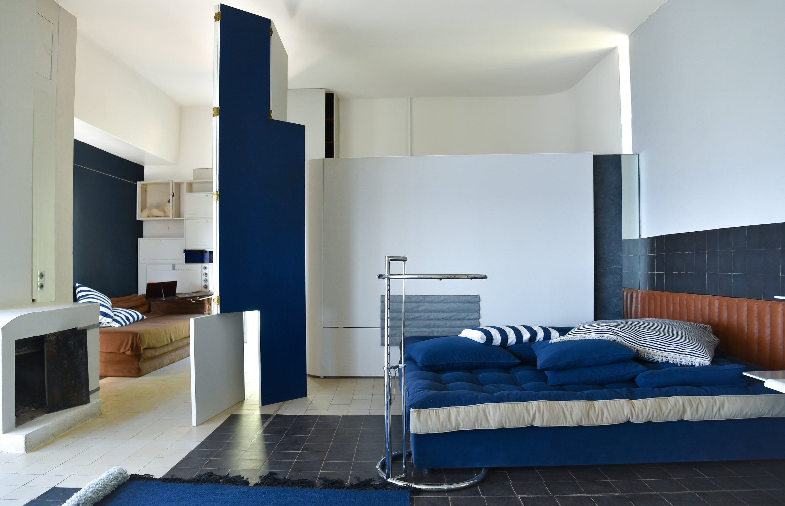
MAIN SALON WITH DAYBED AND TRANSAT CHAIR
sea views through a glass walL AND BIBENDUM CHAIR
MAIN SALON FROM CURVED ENTRY WALL
“The house was built for someone who likes work, sports and entertaining friends. Despite its small size, the house must allow its occupant to receive guests and make them comfortable. Only the “camping” style made it possible…”
- Eileen Gray
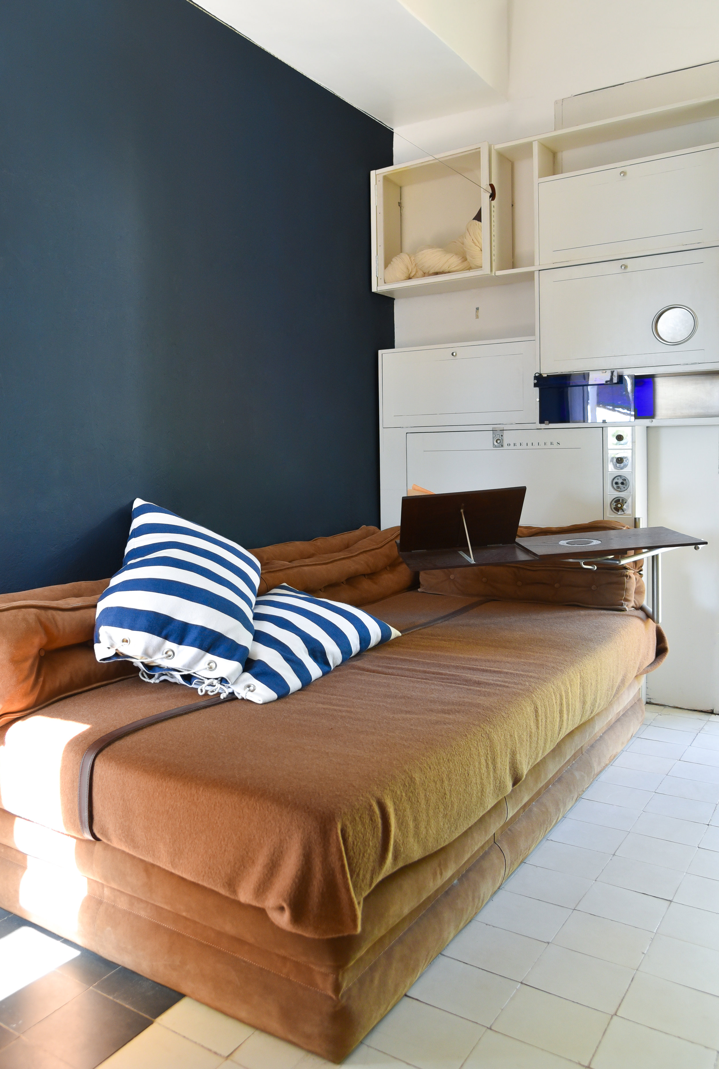
The “someone” Eileen was referring to in that quote was Jean Badovici. He was known for being gregarious and unreserved, and loved to entertain. Gray’s “camping” style meant absolute flexibility of house and its elements. Furniture was lightweight, moveable and changeable. There is no wasted space in the villa. Her extremely practical sense incorporated extraordinary solutions for both built-in and freestanding furniture as well as storage space. Stenciled inscriptions and use of specific colors organized everything logically. Things that weren’t needed immediately were neatly tucked away allowing for a clear space to entertain a good number of guests. On the other side of the entry wall is a hidden place for coats and a named place for hats. Walking into the main salon you cannot help but feel you are on an ocean liner in the middle of the Mediterranean Sea. It is incredibly atmospheric; the blue black of the walls, tile and deep pile rug. The curved shapes and built-in storage along with the warm leather of the headrest neatly fitted into the wall are exactly what you might find in a ship’s cabin. One of the greats, the Transat lounge chair: these were used both inside the villa and outside as deck chairs. The now famous E-1027 tables were moved around the home wherever needed as were the nautical cushions. And the map! The maritime map that would be lit at night inspiring thoughts of faraway journeys..
The music corner was wild! The custom-built column for holding records was something we hadn’t seen before. A celluloid half cylinder shape enclosing record player we were told, amplified the sound. You may recognize the divan against the wall. Eileen thought of this as an indispensable piece of furniture due to its versatility. One or more could sit or recline and when needed, with the addition of pillows, could comfortably sleep there. Flexible seating, extra sleeping space for guests deciding to stay the night and state of the art music – all perfectly suited to Badovici’s lifestyle.
I think by now it may be right to say that Eileen and Jean had different ideas of what this summer home they were to share would be. Badovici was much younger than Gray, his reputation came not from architecture, but for being an influential critic and editor of the magazine L’architecture Vivante. He became good friends with many important architects of the time, one being Le Corbusier. Often times this would mean many people back at the holiday home. Gray had a natural shyness about her. She had a very real need for time alone to refocus on her own intimate and personal values. She often times needed her private space. In her words: “We have tried in this little house, to express in parallel two lifestyles: the “camping” style which responds to a circumstantial need to exteriorize, and the regular style which grants the individual an independent and isolated center where he can develop his deep powers. One must allow for the present need for movement and agitation to come to an end…” She succeeded in achieving both.
The feeling of complete openness as the main salon is effectively one large room or the atmosphere of complete privacy, whichever one wished, was achieved by what the architect called the “transformable” room. The walls do not come close to the ceiling allowing it to be seen in its entirety from all points giving the large space room to breathe. It appears that nothing is closed off. You may recognize the Bibendum chair centered in front of the impressive wall of glass panels. The original Bibendum, made for E-1027 was upholstered in an ivory-white fabric. ‘Composed of a stacked cylindrical backrest it drew its name from “Mr. Bibendum” or “The Michelin Man” whose cartoon body was made up of stacked white tires.’ A good example of Eileen Gray’s humor, but never at the expense of comfort or good design. The wall of glass panels fold upon each other like an accordion. Mr. Badovici may have had a hand in this creation as it was he who took out patents on the design in both France and America. The panels can be pushed completely to one side opening the entire vista to the sea air and sunlight. This also allows the living room to spill out on to the terrace. And then there is Gray’s brilliant use of a material made to be rolled back or removed with ease. Sailcloth for the awnings and on the rails could be simply removed bringing you, quite literally, out into nature. Eileen had been visiting the South of France since she was a young girl with her mother. She developed a lifelong passion for the Mediterranean landscape and couldn’t imagine building a house here without an unadulterated view of the sea. Eileen had always loved the sea and quite often spoke about its “special grandeur.”
Privacy was achieved through moveable screens, furniture and built-ins. No surprise here as Eileen was already well known for her screens. But the salon screen at E-1027 is unlike most that come to mind when we think of an Eileen Gray screen. This folding sliding piece was made of wood painted blue and white on theme with the villa. Function first. It was a necessary component, fundamental in achieving the transformable room. In the photo above the screen is folded to allow a view of the guest area to the left. When extended completely, screen becomes wall allowing for complete solitude if one wished. Let’s take a closer look at the guest niche..
The guest niche on the main floor is a fantastic example of how particular and efficient Eileen was with space providing us with a glaring example of her intense desire to fulfill every human need without compromise. For Gray, comfort meant freedom. Her highly intellectual mind combined with her practical sensibilities allowed for much more than basic essentials in this technically small nook. Here we saw comfort give way to luxury.
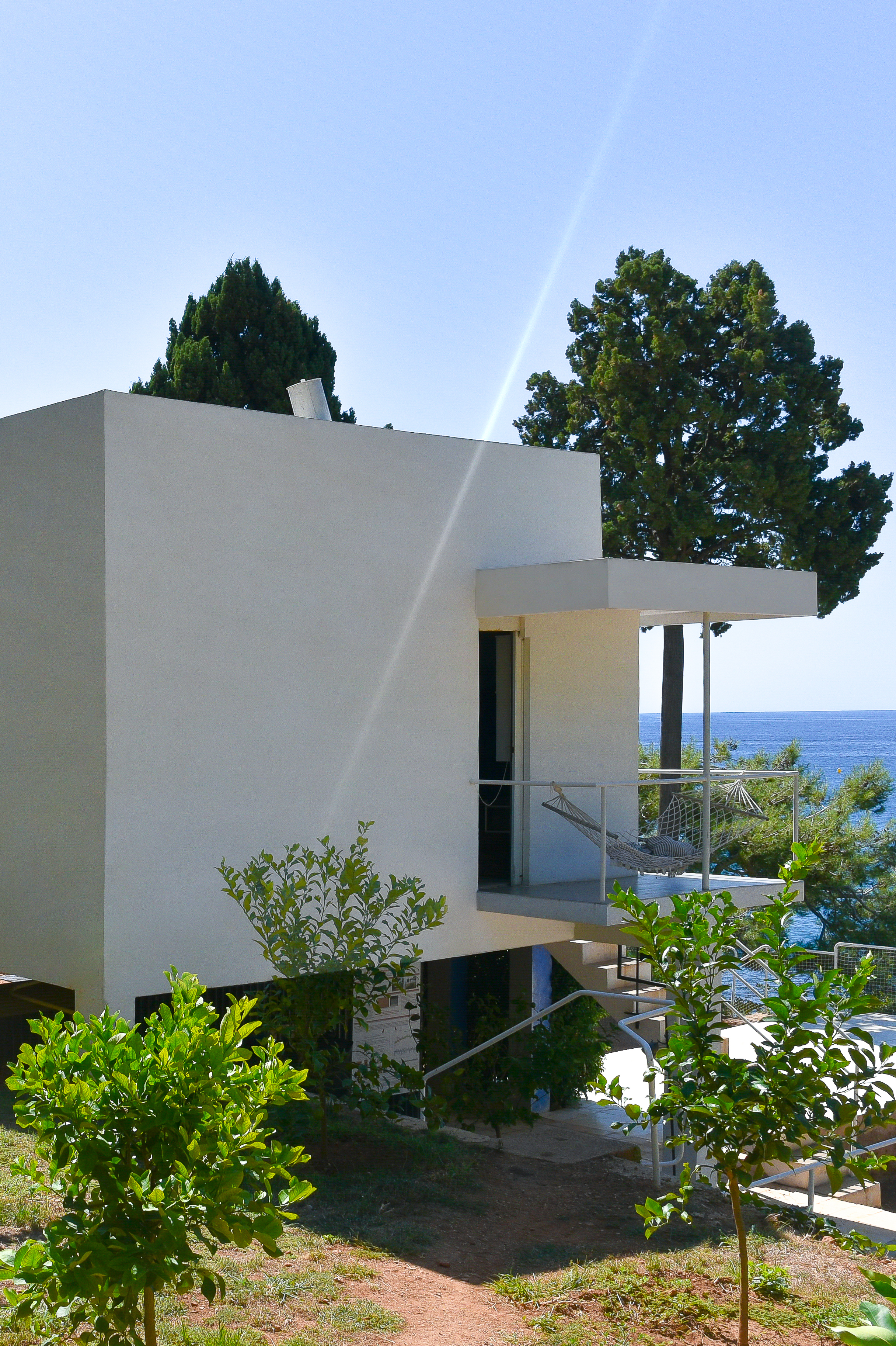
There is complete privacy of not only the sleeping area, but also the guest bathroom which is hidden behind the half wall. The storage cubbies; some assigned, some not and the dual use light for reading or mood, with easily accessible switches seem practical. But I said luxury. Gray made sure to give this corner retreat a wonderful escape. The option, if one was so inclined, to sleep out in the crisp Mediterranean air she so loved. Just outside the guest’s door a hammock hangs protected from the roof of a small open porch. For me, falling asleep close to nature, with the soothing sounds of the sea is the very definition of luxury.
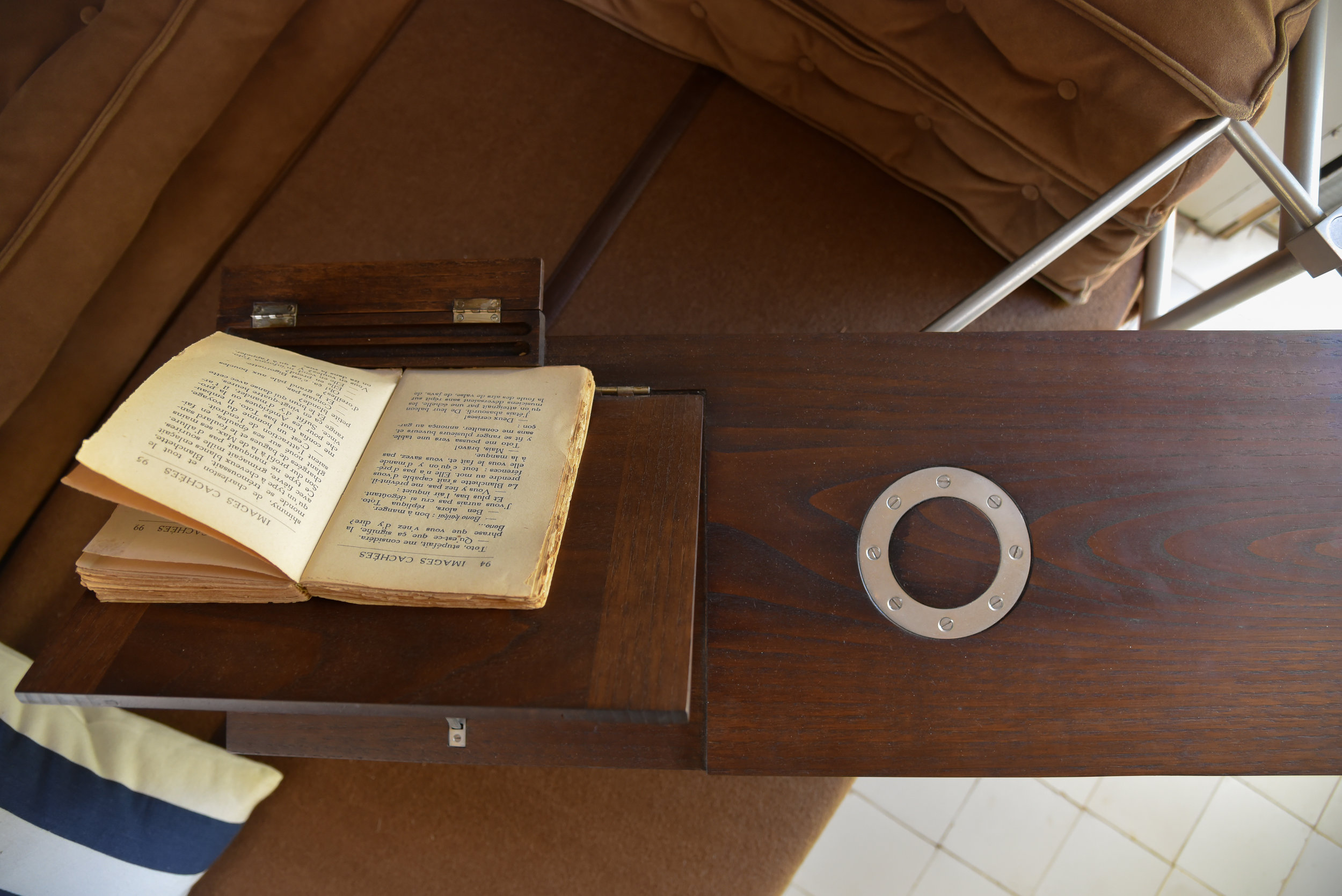
Back inside, we were focused on the rotating bedside table. In this design the reading tray can be lifted to support a tilted book, the pages being held open by the pencil box at the table’s edge. When not in use the foldable backrest lies completely flush with the table top. Now you can write a letter or maybe breakfast in bed? A nice place to rest a glass of wine in the evening.. It was produced without diagonal bracing so as not to interfere with the bed while being rotated toward the guest. This is more than “good design.” Like all of Gray’s designs this is meticulously considered, deliberate design. We were told that Eileen Gray studied “ a thousand and one tiny hand movements” for her furniture and tables.
“What you have to do is to give the object the form best suited to the spontaneous hand movement or instinctive reflex corresponding to its use”
– Eileen Gray
TERRACE VIEW TOWARDS MASTER STUDIO
The master’s quarters anchor the opposite end of the large living space at E-1027. Decidedly more private, with the master bed and bath able to be completely hidden. The work area or master study is entered first. The washing alcove is straight ahead. This small wash room could be used by guests if the other bath was taken. Gray designed this space so that the more private areas of the “boudoir-studio” - the master bed, master bath and private outdoor terrace would not be disrupted in such events. She did this by using a large freestanding piece of furniture, the coiffeuse, as a screen or divider. It was made of aluminum and cork and though it has been reconstructed we were not able to see it on this visit. This piece in place would make these quarters almost invisible to the eye. You are also able to exit from this area by way of a small exterior staircase. “The independence of each room is assured.”
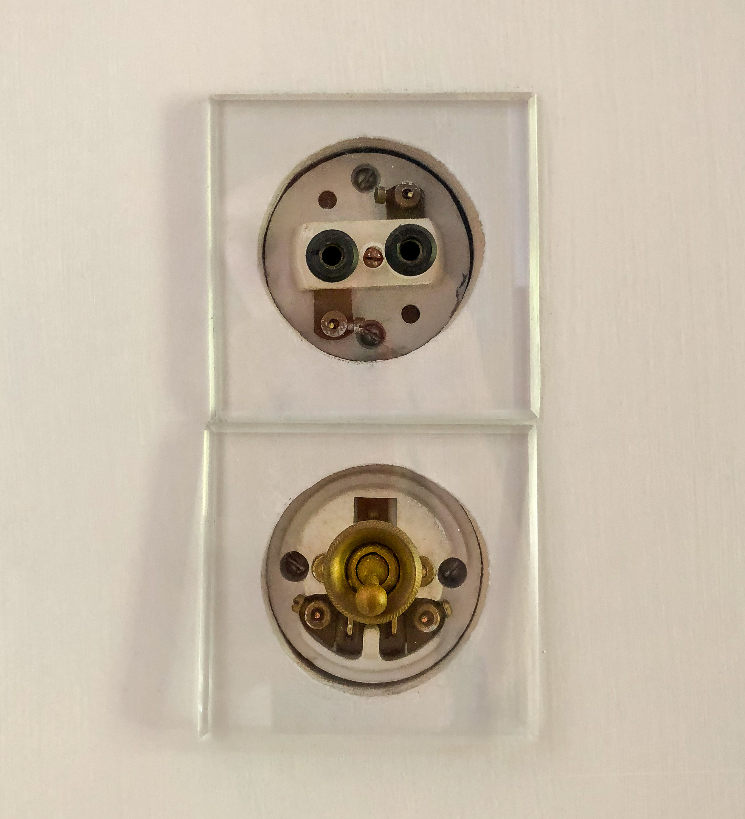
Missing from the master bed area is the uniquely designed cylindrical encasing for the mosquito netting you see hanging above the headboard. She used the solution of a transparent celluloid case to store the net when not in use as she found ordinary mosquito nets to be heavy and inelegant. There was also a double-jointed bed table, you can see in the photo where it would be attached next to the round outlets on the wall. On the side of the bed with the white lamp and blue nightlight there is a fixed document holder and some shelving which Eileen called a “small library.”
I did want to point out that the work area, with the small washing alcove also has its own outdoor terrace. When we were there, the study furniture was not, which is a shame (for me, selfishly). Sadly, we were not able to see the drafting table that will undoubtedly be set back here at a later date. That table is a thing I covet. I know, not good form to covet a thing, but I do. Since I cannot have it, cannot even show it to you, we are moving on.. to another thing I love; the file rack. This is an exact replica of the original Eileen made for E-1027 in 1929. A quick note on this as I think it is a great example of the reconstruction process for these missing treasures. Since there is no physical example all that can be used are photos and Gray’s drawings if they can be found. To render this file rack, the design had to first be figured by constructing a reverse perspective for comparison to the original photos of the villa taken by Ms. Gray herself. These period photographs, taken by the architect between the years of 1926-1929 are a profoundly reliable source. They enabled verification of the original dimensions. In addition, the shadows in the photos were reproduced in a 3D study which revealed some of the more obscure elements such as the connection of the metal frame and brackets. The materials were found in other objects that Gray designed during the same time period. Not so simple but quite interesting I would imagine, like piecing together a really well-designed mystery.. The next chapter in the restoration of the villa is concentrating heavily in this area. No doubt another visit will be in order.
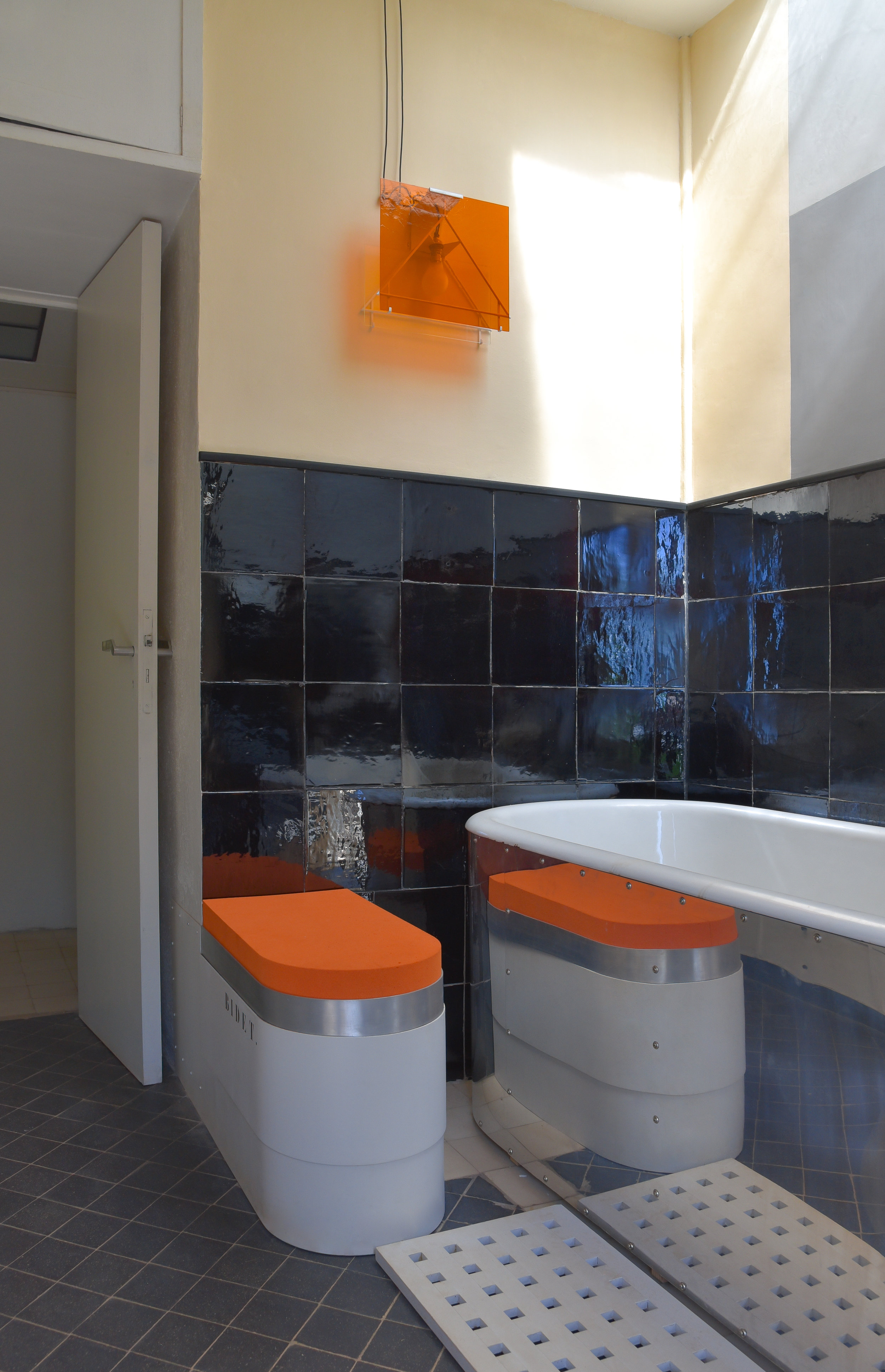
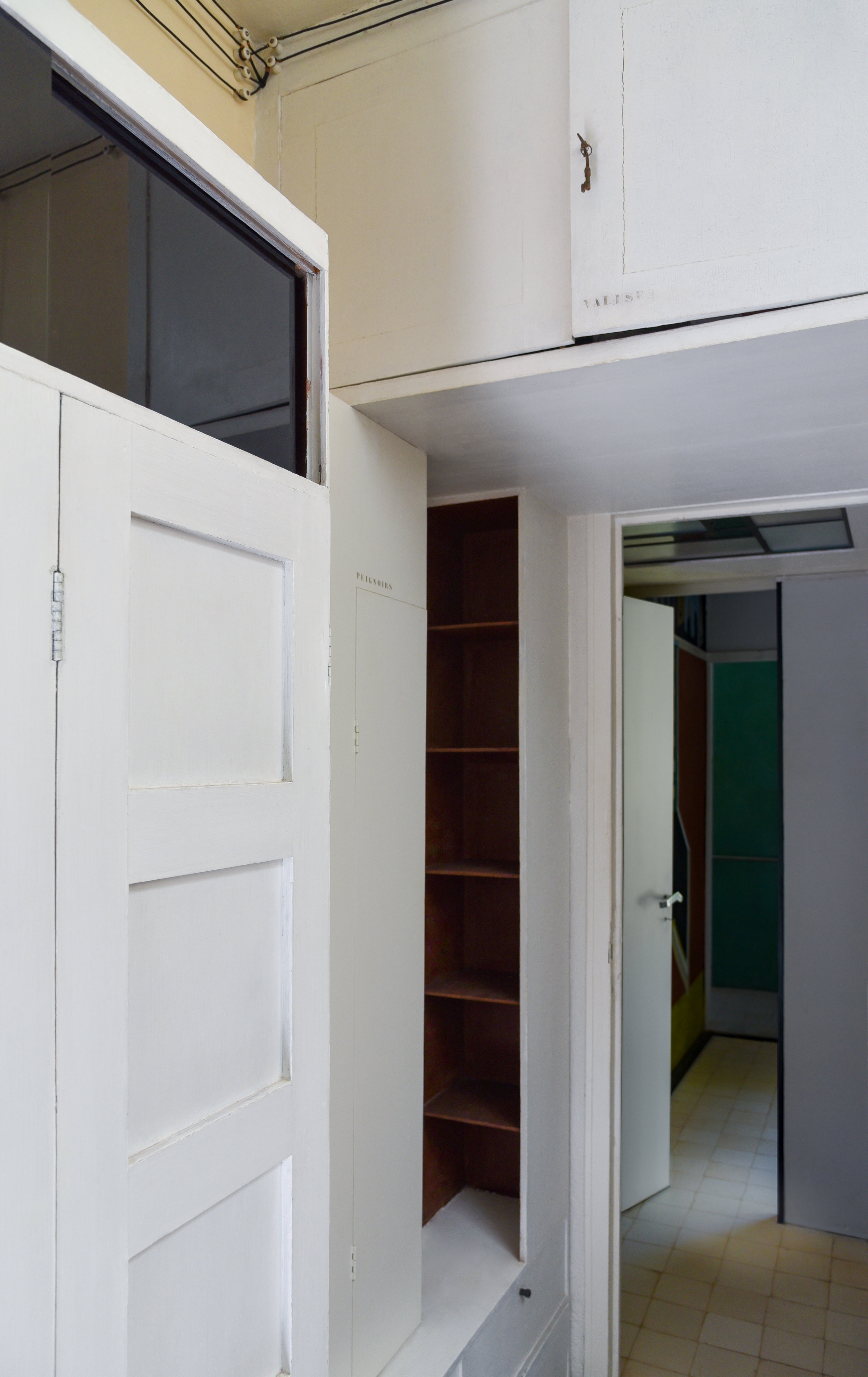
In my humble opinion, the master bathroom needs a moment here. Gray used four contrasting colors to create a more dynamic secondary area. Though the bathroom’s actual footprint is small, once again she has utilized space in such a way that it doesn’t seem small. The cabinet above the entrance door provides suitcase storage. The built-in wardrobe keeps a shoe rack and dressing gowns, while the corner shelves you see painted in marron were used to hold undergarments or pajamas. That same marron color is seen in other places throughout the house to hold secondary items, such as hats etc. The villa is communicating again, through stencil and color. A soft push in the right direction from the architect almost whispers: look, all the work is already done, unpack quickly and go enjoy! The bathtub, and I quote: “… is a very ordinary one, but it has been covered in an aluminum sheet that gives it a pleasant aspect and brings some gleam to the whole ensemble.” It does indeed. Again, a wonderful use of ordinary industrial materials in an extraordinary way. The tub is set nicely into an alcove with a skylight above. My favourite bit was of course the bidet, which doubled as a stool with the addition of the bright orange rubber foam cover. You can’t possibly be wondering why, can you? First, what is not to love about a bidet, labeled as such, taking on more than its one very important job? The fact that the addition of a simple rubber foam cover made to transform it into a stool is both thoughtful and kind of amazing. I cannot for the life of me think of why anyone with a bidet would not pinch this idea tout de suite! Further to this: orange. Bright (even safety) orange has been my favourite color since I was a child right into my adult years, now usually coupled with military green or navy. This particular fact is neither here-nor-there at the moment, though it may come back around at some point. One never knows. Opposite from the bidet, at the eastern end of the room the bathroom has a bright glass door that opens to the outside. If left open, which we were told it often was, there is a direct connection to the nature surrounding the villa. Closed, you could still see the greenery of the landscape and blue of the sky.
There are so many wonderful details at E-1027; Eileen Gray was nothing if not a stickler for details. Unique details and design. A good example of this is her lighting for the villa. Instead of buying traditional lighting, she simply made it, often with just a bulb and painted glass. The light boxes built into the headboards of the beds were especially distinctive. Thoughtfully, she made them to serve two functions. The white side for reading and the blue used as a night light. Ms. Gray liked to evoke specific associations with her interiors. That said, her placement of a light on the map pinned to the north wall was no accident. The soft light was kept on in the villa throughout the night just as night lights on a ship, with the nautical map as a backdrop. Perfect for her ocean liner by the sea. The original map itself was a piece of art. Gray pieced together two marine maps showing the island of Santo Domingo, where we were told a good friend of hers from her younger days in Paris, artist Stephen Haweis, had recently moved. Collaged onto the map, a quote from Baudelaire “Invitation au voyage” invitation to travel, “Beau Temps” fine weather and finally “vas-y Totor” Go Totor go! Totor was the name she gave her car.
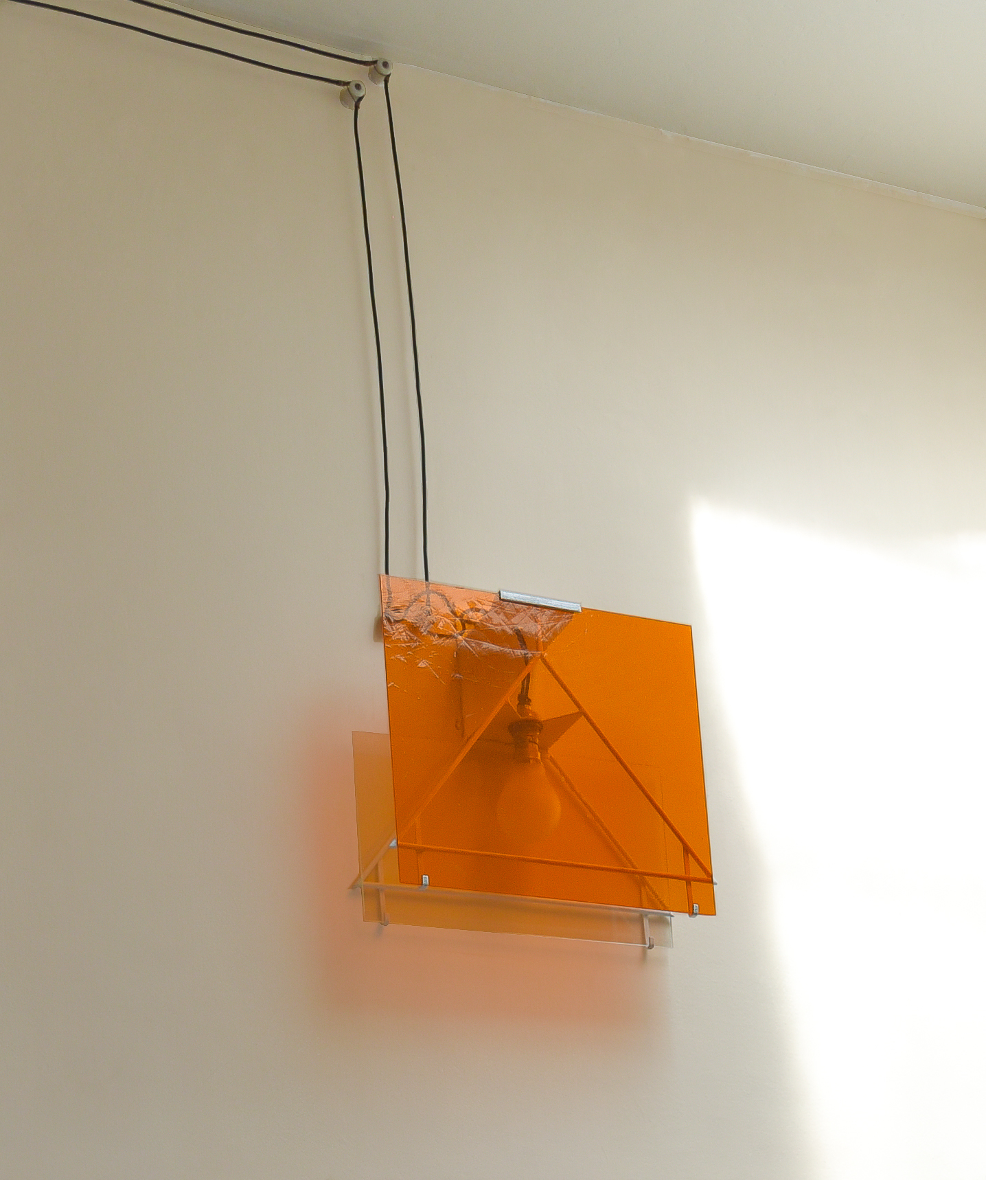
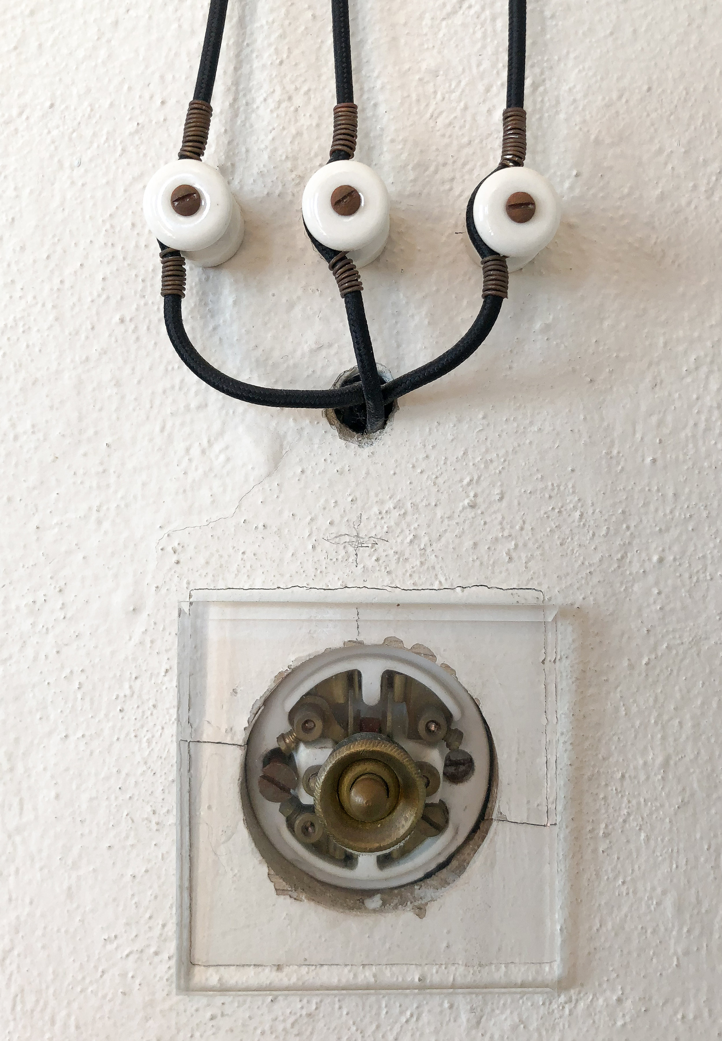
Eileen had a way of perfectly balancing her design aesthetic with honesty in materials. Exposed electrical wires and industrial pieces were not disguised. She saw no need for it. This is a direct example of her thoughts on interiors that may have differed from others of the time; that each circumstance called for a unique design. Here this worked well.
“The practice of employing uniform and standardized models is … contrary to good taste, even to good sense.”
- Eileen Gray
As I write this I am thinking about an interesting fact. This house, unlike any other we have seen, was conceived of and carried out by one incredible mind. Literally everything you can see or touch in villa E-1027 came from Eileen constantly thinking and rethinking to perfection. Not thinking only of better design, but how that design must easily interact with the people who would be living with it. From her clever stenciled directives to her built-in color-coded storage cubbies and fluid components. This house, in Eileen Gray’s “camping style” is truly one of a kind.
There is a small white spiral staircase that leads from the main floor to the downstairs guest suite. As these were not in use at the time of our visit, we entered through the garden terrace. Just inside is the dressing area and wash corner. Above the sink, another well designed object. Eileen’s Satellite mirror; its illuminated small center mirror used “to facilitate shaving one’s neck.” Opposite the sink stands a built-in wardrobe which I believe might be in the middle of being restored to its former glory. Not your average piece of furniture, though none of hers ever was. This wardrobe had a top made of light under glass, a place to hang clothes, store hats and even a hidden shoe compartment. In the photo above, you can see the pivoting drawers opening outward from the corner. A detail Gray used in much of her furniture design. Further inside, a place for rest. It is quite a calm room, the fade of the walls and the sunlight peeking in through the open shutters.. must have been a wonderful place for a guest to have privacy. There is a davenport bed and portable vanity made of tubular steel metal with a rosewood veneer top. I am told the original had pivoting drawers. Across from the sleeping area a built-in that the architect called “a polyvalent piece of furniture with multiple drawers, bookshelves and a foldaway writing table.” Her ingenuity knew no bounds. It is quite impressive how almost everything she made to furnish E-1027 had a variety of purposes and uses.
SOUTH FACADE of E-1027 facing the mediterranean sea , 2018
The south façade looks out on to the most beautiful blue waters of the Mediterranean Sea. On this side, Gray’s use of maritime style is clear. A stark white render, railings and the most brilliant use of sailcloth for awnings and chairs. It is superbly reminiscent of a boat anchored at the shoreline. The white life preserver we were told, is the very same that adorned the building in 1929. Eileen Gray had already accomplished so much by this time, but the completion of her first building on this rugged coastline 100 ft above the Mediterranean; her first architectural accomplishment fully realized, meant something to her. She credits Jean Badovici saying ‘I would not have undertaken such an architectural leap without the encouragement of Badovici.’ And so, she shared the authorship of the house and named it E-1027. For those of you who have heard this one before, please excuse me for a moment while I share it with those who have not. Many thought villa E-1027 was named this way for the purpose of looking like a boat registration. In fact, the name Eileen gave to the house had quite a bit of significance. E for Eileen, 10 and 2 corresponding to the tenth and second letters of the alphabet; J + B ( his initials) and finally 7, or seventh letter of the alphabet for G or Gray. Since the holiday home was to be an escape for the two to share, “a little hideaway” she called it, E-1027 represents their names intertwined.
Eileen completed the villa in 1929. She was fifty-one years old. It is said that the two spent the summer months here, but that it ended rather quickly as Eileen decided that his lifestyle was quite opposite of what she wanted for her own. In 1932 Eileen Gray left this place, in its entirety, to Jean Badovici. I read that she did not even bother to take her belongings. Having already purchased three plots of land in nearby Castellar, she set out to build a house of her own.
“I like doing things, I hate possessing them. Memories cling to things and objects, so it is best to start all over again.”
– Eileen Gray
